Items in rows are stacking vertically on mobiles

I’ll have to check to verify it, but I’d assume so. Whatever Pinegrow normally does. I didn’t create an additional .css file or anything like that. It should just have the boostrap and style.css files, with the style one containing all my custom rules. Were you thinking that maybe there was no style sheet, and so it was unstyled? That’s not the case, and remember that it DOES display perfectly fine in many other devices, so it’s not (seemingly) the code…

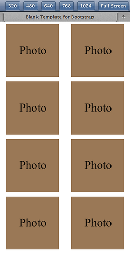
I just had another WTF moment… I did a new project, and just dragged in a premade Bootstrap block (one of those 4 column thumbnail gallery things)… and now IT TOO is displaying incorrectly!.. right in Pinegrow!

I’m thinking I need to reinstall Pinegrow as one thing to try. Maybe something is corrupt… but then WHY does it actually work on half the devices?! Literally ALL the columns are along the left edge… as if horizontal stacking is just not a thing. I seem to have broken the horizontal stacking capabilities!

UPDATE: In that screenshot above, I tried all four of the gallery blocks, and all but the last displayed incorrectly (vertical stack, as shown in the screenshot). Meanwhile, the fourth worked fine, as do some of the other columned blocks… I’m really at a loss here…

oh!
I’m rather tired but this is intriguing.
tmrw! must look at this tmrw…

and as for style.css, no I was wondering if you had styles in there that OVER RODE the default bootstrap ones for responiveness… or

if you have actulally edited the default bootstrap styles themselves by accident, instead of saveing the styles to a seperate css file, while learning pinegrow. and broken the bootstrap files themselves.
I know I have done that a few times.

and those random devices, well something odd applies to them.

but this is intriguing, this latest behaviour. in pinegrow

Overwriting styles?.. Well, not intentionally. Plus, keep in mind, this same issue is happening with both of my real websites (that I did in Pinegrow), plus the numerous test pages I did (each from scratch, so as to be sure I didn’t just goof something up)… plus, now the preset browser blocks!

I just uninstalled and reinstalled Pinegrow… same issue.

Definitely not me mistyping something… and now, we see it in professionally created code, too.

Horizontal stacking completely broken… on selected assets… on selected devices.

But, it’s very odd that the presets are now acting up (…and I checked and verified those are also now displaying incorrectly in Firefox on the PC desktop).

I’ve got one (very unfortunate) theory… I’m running Win7, and technically, Pinegrow does not support Win7… only in that it uses some 3rd party items that are not officially certified for Win7.

But, again, it’s confusing… Would that affect the producing of code, or just the display of it? If I build a site on a Win7 machine, and then display that page on some other device (ex. Nexus tablet)… would the code itself be ‘messed up’ by the fact that it was produced on a Win7 machine? Doesn’t seem likely that the code would be affected at all… but what do I know?

I don’t have a Win10 machine to test this on to verify that.

But, ya, if you want fire up Pinegrow when you have a chance, start a new Bootstrap4 project, and then drag in one of the thumbnail galleries from the Galleries section of the premade Bootstrap blocks. For me, the first three (1-1, 1-2, 1-3) all have the issue… and the fourth (Gallery 2) works fine.

I’m trying to understand their coding. Seems to double up on the container/row thing for some reason. Not sure why. I was ABOUT to try that on my own test page (figuring THAT was the key to get it to work)… and that’s when the presets suddenly stopped working properly, too.

Good grief… Now I just created another new test (simple Container > Row > 8 columns thing again), and it is working fine in Pinegrow (as it previously was, but I wanted to just make sure that what was happening with the blocks now wasn’t happening with ALL columns of any type).

Then I uploaded it to view on the Nexus tablet… and NOW it’s doing the OPPOSITE issue! Rather than showing (say) 4 columns per row (…I had set specific numbers of columns for every screen size), it now has ALL of the columns stacked HORIZONTALLY… and on top of all that, it’s doing it in a way that is resulting in a horizontal scroll bar appearing!

Same code, different results…

It’s completely ignoring the breakpoints (it should be displaying the XS and SM layouts), but instead, all the columns are horizontally stacked now… 8 columns, even though the MOST that should be displayed is 4 per row.

Can you share the link to? I mean a real link to your result? Not any screenshots and/or bloody blank code snippets?

Just a plain url?

Cheers

Thomas

@ladlon hi, I’ve read every post in this thread and I’m finding this very confusing. Could you please post what’s the current version of Pinegrow you are having this issue in, e.g. 4.1 or 4.3, then can you also post what framework you are using Bootstrap 3, Bootstrap 4 or Bootstrap Blocks. You’ve mentioned you’re working on Win7 so would it be a possibility that you could compress your project folder and share the zip file so others could test your project on their set ups and maybe we can eliminate whether its a Win7 issue.

Yep, it’s confusing allright! But, in a nutshell, the horizontal stacking is broken on the display on SOME devices (iTouch and Nexus7, so far), while displaying perfectly fine on Pinegrow, a PC desktop (all browser sizes, as well as Firefox’s responsive display simulation utility), and a Samsung Galaxy phone. Since a few days ago, the issue suddenly is present in the some of the Pinegrow premade bootstrap blocks (which display incorrectly now too, in the PG preview, as well as the resulting PC Desktop browser preview outside of PG.

I was originally on 4.1 (when the issue was noticed), and had since updated to 4.3. Yesterday, I also tried uninstalling and reinstalling PG, just to be sure there wasn’t some 4.1 residue. I will be deleting some of the PG folders (as suggested by support) to have PG regenerate them, to create a full reset.

I previously had not been using any premade bootstrap blocks (my tests and real sites were all created by dragging individual tags from the library). I had only noticed the bootstrap block thing a day or two ago, and I’m pretty sure they were working previously.

The only blocks I noticed with the new issue were the first three ‘Gallery’ blocks (1-1, 1-2, 1-3) of the bootstrap4 set. The projects have always been blank bootstrap4 projects (except the tests with the premade bootstrap blocks, which were ‘bootstrap4 blocks’ projects.

Yes, I’m on Win7 Pro, on a desktop PC (32gigs RAM).

I had actually sent support the test project I did (the one you see the screen shots of), and they had no problems on their devices (although I have only had issues on an iTouch and Nexus7, which they didn’t have available to test… All other devices worked fine for me).

I’m kind of new to code/file sharing on forums. I just had learned how to do the code sharing during one of my previous posts.

I’m no expert, but it seems it must be some of the generated support files (either the bootstrap style sheet, or more likely some of the scripts or bootstrap files… as the issue happens on ALL new sites/tests… so, it doesn’t appear to be just a mistyping or something in the html code itself. Everything LOOKS right, as far as I can tell. The tests I’ve done are as simple as I can make them… Container > Row > Column. No other bells and whistles.

It seems it might be a Win7 thing, as I know that some of the 3rd party assets used in PG are not officially certified for Win7… but I’m puzzled by whether that would affect the code itself, or just the display of things on the Win7 system. If a site were created in Win7, but then viewed on some non-Win7 system, would the incompatibility still exist?

How would I go about sharing a zip on the forum? Would that be via the upload system? (I wasn’t sure if that was just for images or not). I could upload the zipped test, which I had sent support.
Bootstrap blocks included within Pinegrow are created with Bootstrap 3.3.6 (so your project will be using Bootstrap 3.3.6) and there are currently no plans to provide the “same” bootstrap blocks updated with Bootstrap 4.

We have no ETA yet, but new blocks using Bootstrap 4 may come in the future.

Interesting… Okay, good to know!

Again, it’s only those first three Gallery blocks. I have to really study them, and see how their code differs from the fourth, and hopefully get a sense of what specifically is ‘broken’ on my side.

But, this issue with the premade bootstrap blocks is new (since a day or so ago). They were working before. Maybe it was brought on by me updating to 4.3.

The original issue (vertical stacking present in my tests and real sites) involved pages made by dragging the individual tags from the library (manually built), not any preset blocks.

Hopefully, I can find someone here with either an iTouch or Nexus (or some Android device), as those are the only ones I had the original issue with.

I think one critical factor here, is that the professionally coded samples from the w3schools multi-column page samples in their ‘Try This’ sections (where they have the split screen of code and display) also do not display properly on those two devices… and that has nothing to do with Pinegrow… so the devices (for whatever reason) appear to be the issue.

Still, the question is why?!

But the bootstrap block thing… yep, that’s a PG thing! Hopefully that gets fixed by me deleting the folders as you suggested. I’ll try that today. It WAS working before, though… so maybe something just got buggered up.

As shown in my last support message (including a demo video) there is currently no known issue in Pinegrow 4.3 with the display of the concerned bootstrap blocks whatever the breakpoints which is used.

Still, I don’t know the origin of your issue.

Agreed. Hopefully, something just got glitched on my side. It WAS working before.

Awesome! Okay, I deleted the Pinegrow folder from the Users/AppData area, and re-registered Pinegrow, and that (so far) seems to have fixed the pre-made Bootstrap block issue.

I’ll test the other blocks, but so far it looks good.

I’ll also re-test the overall original issue, involving the sites/tests viewed on an iTouch or Nexus. Although, I suspect that’s going to be a different thing. But, maybe not.

Thanks for that, earnoud.

1 Like

@ladlon glad to hear you’re making progress. If you find it has solved your issues, including others you have posted, would you mind posting similar post in the other threads once you’ve established whether they are solved or not. Might be helpful to somebody else in future. Thanks.

Okay, here’s the latest…

The prebuilt Bootstrap block issue is fixed.

So, wtih the newly re-registered/reset Pinegrow, I built another test page. Same as before… Container > Row > 8 columns, each with a small test image block (set to Fluid).

I set the breakpoint rules (2 columns in XS, 3 in SM, 4 in MD).

Everything fine in the Pinegrow preview… Everything fine in Firefox on the PC desktop system (…so, as it was before).

Now, I uploaded it, and viewed it on the Nexus tablet… and it’s broke… but in a different way than before.

Previously, we had all the columns vertically stacked, going along the left edge (as if they were all block item elements).

Now, we finally DO have horizontal stacking… but now we got the OPPOSITE issue… it is displaying the pages with ALL the columns side by side, in one line… rather than doing 4 rows of 2 in XS, 2 rows of 4 in MD, etc). So, the horizontal stacking is there, but the page is not stopping at the right edge of the screen, but continuing on offscreen (complete with horizontal scroll bars).

So, it’s like it’s not detecting the actual size of the display now.

Any theories?


(On the Nexus…This should be 2 boxes across, not all of them)

It’s doing the same thing on the iTouch… Single horizontal row of 8 boxes, screen extending out past the right edge of the display, complete with scroll bar.

Meanwhile, on the Samsung Galaxy phone, it’s displaying just fine (as it is on the PC desktop)!

So, same deal as before… only now, rather than all the columns stacking vertically along the left edge, the opposite problem, where all the columns are stacking horizontally, with NO vertical stacking when it should be.

Just got to get something in between, and we are gold!

While I was browsing, I found this:
Is there something related to your issue here: https://github.com/twbs/bootstrap/issues/5591 ?

Just in case.

2 Likes

Interesting find. I’ll have to read through that carefully. Might be a bit over my head, though!

Keep in mind, this issue is also happening on an iTouch, too.

On the iTouch, it is showing 2 boxes across… but the remaining boxes are off the right side of the screen (so, one row of 8 boxes).

Unless it’s a coincidence, it seems like on the iTouch, the SIZE is displaying correct (each box is 1/2 the screen, in what I would assume is an XS mode), but it is not stacking the 3rd box down to the next line. You end up with this ridiculously wide screen that you scroll across.

Very interesting that we have the same issue (not displaying properly on an iTouch or Nexus)… yet, suddenly, it’s the OPPOSITE problem than before. Kind of feels like having a monitor that is not displaying the blue channel… and then suddenly it’s displaying ONLY the blue channel!

I suspect the change may be due to the update to 4.3 (from 4.1)…only due to the conincidental(?) timing of its appearance.

So, the main question on my mind (besides ‘WHY ME?!’), is what could/would cause this issue?.. Initially, the question would have been 'what would cause each column to be pushed to the next line, regardless of any rules or screen size… but now, the question would be 'What would cause the row NOT to push a column over to the next page, even though we have no room for it on the row?

I guess one thing I want to try, is to try somehow and force the container(?) or row(?) to be a certain set width, and see THEN if the columns get sent to the next line.

As usual, any theories are welcome.

(Here’s the test on an iTouch. I’ve scrolled the page to the left just a few pixels, so you can see that the 3rd box (and all other remaining boxes) are offscreen to the right, rather than going to the next line, creating a series of 2 box rows, as it is supposed to)

@ladlon I’ve set this layout up and tested in different browsers and devices and it works correctly. I don’t have either of the devices you are having an issue with but I’d be inclined to think its more an issue with them than Pinegrow.

1 Like

Hey, Rob. Thanks for testing that out. Very much appreciated.

Up to now, it’s ONLY been an issue on the iTouch and Nexus… Everything else works fine. So, ya, unless I can find someone else who has one of those, everyone is probably going to find their tests are working fine. My dad’s iPad showed it perfectly fine, and I have a Samsung Galaxy that is displaying it fine.

That article Emmanuel found was intriguing… Shows that others not only had an issue with the Nexus7, but actually knew why, too. It’s from years ago, back at Bootstrap2, it seems, so it’s hard for me to say if it’s been addressed since then. I think I pretty much got the basic idea of what they were discussing… the default ‘tablet’ setting that is used by Bootstrap is actually a ‘phone’ setting, so the display of a site on a Nexus7 is as if it were small(?).

Although that’s not what I am experiencing, the technical reason behind it MAY be part of it… maybe? Seems more like ‘horizontal stacking is broken when viewed on a Nexus7’ rather than ‘the site is formatted as if it’s on a small screen on a Nexus7’… if I’m understanding things right.

Weird that the iTouch is displaying it wrong, yet an iPad displays it correctly. Aside from the possible browser version difference, I’m not sure what would be much different between the two. I think I’m on Safari 5 on the iTouch… No idea what the iPad is. I’ll have to check that next time I’m visiting my parents.

In all the device simulations (ex. Firefox’s responsive display utility, Pinegrow’s device display presets), they display correctly (in the Nexus or iTouch modes). So, it’s something with the ACTUAL devices, somehow… not necessarily their screen size… I guess.

I’m curious… When Bootstrap detects what device it is on, to determine what screen mode (XS, SM, etc) it should be using, is it doing it specifically based on the actual screen resolution, or by some sort of device ID that the hardware has stored somewhere? Is it using the @media? And, is that looking at actual resolution, unaware of the actual hardware (brand, model, etc?)