Hi @kat,
I just took a look at your site and it seems like the gallery is still completely styled using Foundation classes. To get the gallery pictures to take up the whole width and for the pricing to not jump up to the side, you need to wrap the columns with a div that has a class of row. This will also have the effect of taking the pricing grid out of the current flow, placing it below the pictures. Not sure this is what you want.
Cheers,
Bob
@kat re: the gallery the div that contains the pictures has a class large-8 and it would need to change to large-12. Then on each div containing a picture you would need to change the class from large-3 to large-2 for example (applied to first 6 columns in the screenshot). That should allow the gallery to span the full width of the page and display 6 pictures on a large screen.
@kat my advice would be to take the code that is working mcgraphics.us/art and start your experiments again on mcgraphics.us/art/indexGrid.html. If you are using Pinegrow to make changes you might be able to go back through backups and see where it went wrong but I’ve often found myself in a similar position and it has been the easier to just use the last working version, in this case what you have on the first link. Without know what steps you took before things went wrong it would be very difficult to figure it out.
@kat its all part of the challenge and fun of learning and often its when something breaks that we start to better understand things. Hopefully you’ll get back on track and make progress.
Hi @kat,
HTML is all about being very methodical. For (almost) any opening tag, there should be a closing tag. Items that are children of another item need to be within the tags. Those that are independent shouldn’t.
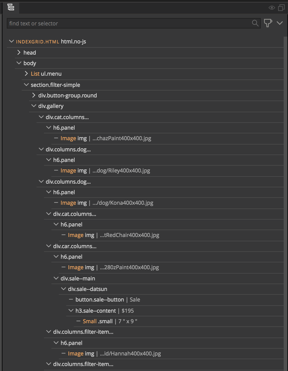
If you look at your DOM structure, you can see that you have placed your lower gallery images inside the tag of your third gallery image.
So you have a div.cat, then a div.dog, then another div.dog. You next div.cat is inside the closing tag for the previous div.dog, so all the subsequent images are part of the third div.dog.
Does this make sense? Other than that you grid looks correct for 5 images across.
Cheers,
Bob
Fixing structure is where Pinegrow really shines. Just closed all levels, cat & below then in the tree dragged all to line up with dog column – voilá!
Now on to css grid sizing, minmax – terror ; )
Here is Maz’s grid gallery. My images are 400px and I want them to reduce proportionately–not happening. Maybe not Object-fit Cover?
Also the gallery runs over the top of the pricing grid. I think you mentioned something about putting it into a row earlier?
Every time something goes wrong my troubleshooting gets better as I learn what can go wrong for next time. Nice thing is that it’s often something simple like moving out of a div in the tree, or not closing a tag.
Why did Matjaž Trontelj use > in .gallery > img rather than .gallery img?
None of object-fit options worked to contain images proportionally in mcgraphics.us/art/indexGrid.html. All images extend beyond grid and crop.
Any way to save open file as a backup in _pgbackup?
Problems with the bottom pricing table. I’ve tried various options which made it worse. I suspect it has to do with the gallery images extending beyond their grid.
Not sure who “Maz” is or when this was used, but the child combinator > is more strict than the descendent selector (a space). Basically, it just means only those images that have an element with a class of gallery as their direct parent. In your case it wouldn’t work because you have wrapped each of your images in a h6 element.
The object-fit property needs the parent element to have a set-height. Right now, that is the h6.panel. Give this a height of 100%. Next, use object-fit: contain on your image, plus set the margin and padding to 0.
Currently there isn’t a way to add a page manually to -pgbackup.
Make the changes to your gallery and see if the pricing table problems persist.
As a side note/question. Why add your gallery images in h6 elements? It isn’t something I would think to do and I’m wrestling if this makes sense semantically. I think it is adding extra styling that might be making your job more difficult than using a div. I’m fairly sure a screen reader would choke hard.
Cheers,
Bob
Took out h6s. Now div encloses imgs. Interesting, new changes in mcgraphics.us/art/indexGrid.html didn’t help grid overflow, cropping and covering price table heading.
Copied from Firebox browser tools
historystyle.css .column, .columns { column-rule: 0; padding: 0; margin: 0; width: 100%; height: 100%; }
foundation.css .column, .columns { position: relative; float: left; }
This page is old & I’ve been redoing for years. Likely initially text in h6.
I do enjoy the process. Hopefully I’m learning.
Thanks for your patience.
Hi @kat , I’m not sure if this makes a difference, but if you grab the corner of of your browser and drag it around, increasing, decreasing window size, you will see that several of the images (bulldog etc) seem much larger, or rectangular in size as opposed to square and as the page morphs and moves, the images move around to fit - yet overlap and squash over each other, leaving artifacts poking out around corners between other images etc, as though there is a white margin or suchlike that partially obscures other images - which are all - different sizes and shapes.
should the images be the same size for this to work this way?
Same shape?
This is why the lower heading appears and dissapears.
.gallery > img { object-fit: contain; width: 100%; max-height: 100%; } mcgraphics.us/art still crops off and on and the grid runs over the h2 in the wrapper depending on browser size.
But it looks pretty good, so I’m going back to Matjaž’s css tutorial.
And hopefully Rob, you’ll do another tutorial, but not on css for awhile!
Another question. This is foundation but web dev tools mention bootstrap. Why?