130 Blocks for Pinegrow - Loads like Bootstrap Blocks for Pinegrow

Introducing Chocka Blocks

http://pluginsforpinegrow.com/downloads/chocka-blocks-130-bootstrap-blocks-pinegrow/

130 unique, mobile first Bootstrap Blocks for Pinegrow. Rapid prototyping for Pinegrow. Build any kind of professional looking website in minutes.Now. Loads just like Bootstrap blocks for pinegrow

Types of components Include:

  • Navbars (16)
  • Headers (13)
  • Intros (20)
  • Content Blocks (30)
  • Blogs and Index
  • Portfolios
  • Counters
  • Testimonials
  • Pricing Tables
  • Contact Pages
  • CTAs
  • 404 pages
  • login & register forms
  • Search bars
  • Footers (8)
  • etc

USE THIS DISCOUNT BEFORE MIDNIGHT MAY14th FOR $7 OFF - chockapine10

Download a free sample here

View some of the blocks here

Will add video when I get a chance tomorrow.

Depending on sales I have about 100 more blocks designed to add to this during updates. Any feedback or suggestions are welcome.

3 Likes

Good effort @benhanna

I’ll be honest, I do believe less is more, especially with block kits and I would offer a preview option (if possible) allowing individuals to test the blocks, that would allow us to offer real feedback as I’m sure when most people visually view block kits, they look at the stock photos/colour scheme, rather than the structure of each block (which is more important).

1 Like

Thanks for the feedback @Jack_Clarity

I understand what you are saying in regards to size, and was planning on replying in the other thread in regards to code bloat. While as a developer its something I want to keep mininal, In my experience most clients dont really care about this as long as site looks great and it does not effect performance, and they can edit css if necassary without issues.even if I was to add a couple of hundred more blocks to this the code wont be anywhere near as bloated as most wordpress themes etc.
Code is also clearly commented and structured in a way that it could easily be manually reduced once a website is finished , or use a tool like unused css, and it still would be a time saver using it. JS is minimal also.

The other kits I have planned will be more minimal, or at least a mix, but I want this one to be huge , really huge, while maintaining performance of course, for rapid proto typing of any kind of site, so it will get even bigger.

A preview is something I want to add but adding all the blocks for preview is hard with a pinegrow kit, compared to say a wordpress theme or html variant, and it would easily be pirated.I will add a demo version maybe with a couple of blocks for download? I will also add a video run through.The pics on site need to be improved also…

Its worth noting stock images are not included in download as the file was too big with them, and they are pointless as you can easily add your own. There is just a placeholder that can easily be removed uding any web editors search and replace tool (or of course you just add one in pinegrow)

I have learnt a lot while building this, when i get a chance I will send on some notes you might find useful when building your own kit.

1 Like

That would be interesting to read @benhanna

The preview suggestion was really to help you attract more customers, as I think it’s important. All Block kits have some form of preview and I know 17 bucks is two cups of your finest coffee, yet customers need a preview.

Or maybe as you mention a video, showing how you’re using the block kit to build a website.

Thats how I learn too, mainly for selfish reasons when I put my work out in the public, the purpose is to help me learn, as people will soon comment on your CSS or HTML, so you listen to their feedback, improve, compare your work with the professionals and you soon realise being a professional web developer is often as simple as knowing how to use google.

Well done! and Yes, Im with @Jack_Clarity with regards the structure/preveiew thing :slight_smile: as the first thing you will do is chuck the stock images etc and see what you can do and its the structure/functionality that matters. So smart moving on binning the stock images too! :wink:
:slight_smile:
well done :slight_smile:

OH yeah! and thanks a lot for the previous free offering of the block cards @benhanna, I shall try and play with them again too.

thanks for the recommendations @Jack_Clarity & @schpengle

And your welcome on the free blocks, I have more freebies i want to put out

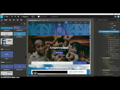
I have added a video (not a master piece) and a free sample download, and some better pics of some of the blocks. Will look at adding more vids and maybe a full preview if the above does not cut it

@benhanna may sound like I’m nit-picking, but I would drop the music from the video! Or if you really want music, what about something more chilled out!

I have been trying to figure out how to change this in youtube and just got it finally!. Need music to mask out background noise recorded by screen recorder , the (bad) track before was added accidentally!

1 Like

Much more friendly! I wasn’t desperately looking for the mute button!

1 Like

ah! I was considering the same advice. My taste in music is pretty varied and ecclectic, but I did scream when it started and flashed back to some crazy Festival scenes in my minds eye…but hey! maybe that was me :slight_smile:

so well done on ditching the toonz!

In other news, the same as @simmo mentioned, I too am having difficulty getting the preview blocks or cards to work in another project.

I manage library, add it, then add all the css, js and other resources to the relevent directories of new project, yet they definately seem to loose their styling or something along the way! your not alone in this, Ive come a croper with the same situation before. Not sure what Im doing wrong. I will have another look after I finish cleaning bathroom and kitchen for friends visit…er… I might be some time…

MAN CAVE ALERT!

HEY!!! , now its THAT TUNE!

the ubiquitous WHISTLE tune!
you can’t go wrong with that one… unless you get screwed for copyright infringement :slight_smile:

1 Like

@benhanna downloaded the preview and in terms of presentation, your blocks visually look more professional without the original photos, much like the original music wasn’t doing you any favours! so as @schpengle mentioned, well done for dropping the photos!

A few minor spelling mistakes, such as Feautures recive Want to join ou team - may seem nit-picking again but worth correcting.

@simmo @schpengle

Its possible to get the blocks working in another project, though this is not ideal at moment with pinegrow. This is because of code bloat and possible conflicts with code. For example you could end up with a lot of duplicate classes etc like lots of h1, h2, h3 tags when editing CSS. if you are careful this won’t be a problem but will mean some manual editing of Style sheets to keep things clean and organised.

To load the blocks into another project (there are actually a couple of ways to do this in PG, this is my preferred way):

Copy the files from chocka blocks folder over into your project or vice versa. You might need to rename some files like stylesheet or main javascript file name to avoid conflicts. Obviously you don’t need to copy files like bootstrap files or FA, or you could overwrite these.

Now all files are in the existing project you have 2 options.

1 Manually add the important CSS and JS scripts

Use a web editor like Atom or notepad to Manually copy and paste the Header and footer scripts (CSS and JS ) over into your existing projects pages header and footer from components.html (or blank.html) Remember to change if you renamed any of these css or js files.You could also do this inside pinegrow using the the code editor.

This for me is the easiest way to load blocks into existing PG projects I just did this and took less than a minute to add them and all working fine.

2 Add the CSS and JS in pinegrow:

first click file>manage stylesheets and add the stylesheets you copied from chocka blocks

go to PRJ>right click on the page you are working on and click add resources…then add in the js files you added

Notes

Sound like you already tried the second one so if first does not work (works for me) consider:

If you have issues check where you added the stylesheets in header. Maybe move down below main stylesheet etc.

Pay attention to structure, add css to css folder and js to js folder, ideally it will have same folder structure and naming as chocka blocks to quickly get things working.

If things still look broke check order stylesheets are in.

Try refreshing or reloading project if you have PG open if still looks broke also

If you still have issues I can do a video showing how I quickly do this (complete with whistling tune ha) , hopefully PG gets a bit smarter at adding component libraries
@Jack_Clarity Thanks, I notice the spelling issues, to be honest I am thinking of replacing all text with Lorem ipsum as this is better for me when prototyping and most users will likely change the text when presenting design to client. I regretted adding the english stuff and wanted to change this before releasing the blocks but I ran out of time and wanted to just get them out there to see how things went,

@benhanna believe me, I understand! When you start selling your product, you always make silly little errors, I’ve been there before in my previous line of work and regarding the photos, if you use the wrong image, you look cheap, if you use the right image, you look classy and elegant.

Even if the code is the same behind the images and I’m learning this myself from what clients like. SImple, Classy and Polished, which actually means less work for us developers and designers.

Looks like your product is selling, so you’re now a professional block kit seller :sunglasses:

Cheers @benhanna, I think there is a bug in PG with regards Using Projects as a library and adding/ resources to the library.

Ive followed the docs here
http://docs.pinegrow.com/pinegrow-pro/components/libraries
and in the second part, where it explains how to add the assets to Project A so you can use in Project B
well, it doenst seem to work as

It maps all the assets to the
/css
/images
/js
directories,

NOT to
/components/cards/css
/components/cards/images
/components/cards/js
directories,

I will mail this or stick it in the Bugs section now or both.
so EVEN AFTER following the instructions, you then have to add
/components/cards
to the Path of each image in your cards blocks, by either navigating to the specified block on your page and checking its Prop value and selecting the correct /components/cards/images/THE ONE I WANT.jpg

Also, it might be an idea, for the future, with your blocks/cards resources to follow the instructions on the above link, in order to add all your resources (pics,css etc) to the LIbrary Resources so that, when this bug is fixed, people can THEN just use your project as a library.

as it was I had to manually go in, follow the above link, add the resources to its library Resources so that they would THEN be copied over to /components/cards/images or css or whatever/ in my project.

However!

Pinegrow then ignores this when it goes to use your cards!
meh!

here you go, Ive posted a bug report on our forum in what looks like the same topic with regards blocks and broken links

I get your work around and it works, however every time you update one of your components or an image, you will have to manually copy across all the relevant CSS/ JS, code, and images to EVERY single project that has ever used your components/cards/carrots, whatever.

the PG way
here
http://docs.pinegrow.com/pinegrow-pro/components/libraries
is Scaleable!
and every time you update the original project you just have to go to others that use it and click on update library resources in the Components menu.

job done!

however, it doesnt seem to work correctly, so I think the correct way is to follow their way,
and then manually edit the paths to add
/components/cards
for the time being, until this bug is addressed

or whatever the library or project library resources are in after setting them up in the original project your cards for instance and then Add Project as a Library

or , I could be wrong :wink:

mmm, also, what is the difference between these being added as a project library or as a plugin?
I find the whole, undocumented just look at these other 3 plugins and work it out philosophy a little scary :smiley:

@schpengle hopefully @MhdAljuboori @matjaz & @Emmanuel have fixed this for the upcoming 3.0 release! it’s definitely an issue, especially if developers are going to offer block kits, without having to release a 100 page instruction manual explaining the workaround to load project as library lol

@Jack_Clarity

Indeed it would be great if this is made easier in future updates

@schpengle I see what you mean, the way the blocks and file structure is set up is ideal for creating a new project to go live. I will def look at adding another folder in the download for adding components to another project in a more structured way, so it makes both easier.

I should probably note the blocks mentioned above are very straightforward for creating a new project, just download, unzip and open the folder as a project and start dragging in desired blocks.

An example of the difference between a plugin and library would be if you check out the kelvin plugin or grayscales.

You can use components in a plugin and can also set them up for added functionality, for example click on the header and you have an option to make small or full screen, add overlay etc…I am looking at developing a kit with this kind of functionality on a larger scale than the above plugins.

@Jack_Clarity

Sounds good look forward to seeing it