TEMPEST
February 15, 2026, 12:19am
1
I have created a div container for my ‘custom nav bar’ code. See here:
The CSS treats it as an inline-flex so that I can vertically align all 3 sub divs (The animated burger menu button, the site logo home button and the shopping cart button).
The problem is, when I try and put anything else on the page, it doesn’t snap to underneath this element, it goes under/over it!?
Here I’m using INSERT to drag an H1 tag, expecting it to snap to underneath my container div, but it’s going under/over it…
When I let go, this is what I get:
Please can someone help me and explain where I’ve gone wrong?
Thank you.
Try using an an all encompassing Div.
ie, one div for the entire page content,
or use actual semantic web page layout to make sense of the page, for screen readers etc.
ie, your missing the
<header>
element completely
then within this Section,
<nav>
element to define the …navigation section.
This may help
W3Schools offers free online tutorials, references and exercises in all the major languages of the web. Covering popular subjects like HTML, CSS, JavaScript, Python, SQL, Java, and many, many more.
Also, if you want to paste code into this forum (which appears to be a discourse forum)
Posting code or preformatted text on the forums Have a line of code you want to share on the forums? Perhaps you need to share an error log or file in your mod? Reading code without formatting can be tough, if not impossible if the code depends...
Reading time: 1 mins 🕑
Likes: 14 ❤
so four spaces infront of a single line of code will format it etc.
1 Like
TEMPEST
February 15, 2026, 2:01am
3
Thanks for your advice, but unless I’m still being a silly-billy, it didn’t work:
well, if your using Bootstrap,
<container>
ok, im not sure actually.
NB, THIS IS WRONG… see down a bit for the error correction.
TEMPEST
February 15, 2026, 2:20am
5
No, I meant vertically - their centre’s are all on the same horizontal line despite them being different heights.
Ah, ok , I understand, but thats not semantically correct.
now try this code,
<!DOCTYPE html>
<html lang="en">
    <head>
</head>
    <body class="bg-dark text-white">
        <div class =container>
            <header>
                <nav class-"aiboetc-navbar min-vw-100 ">
                    <!-- Burger Menu -->
                    <button id="hamburger" class-"hamburger" aria-expanded-"false" aria-label="Toggle Menu">
</button>
                    <span id="sr-label" class="sr-only">Open Menu</span>
                    <!-- Logo -->
                        <div class "aiboetc-logo">
</div>
                        <!-- Shopping Bag & Counter -->
                        <div class="shopping-bag-container">
</div>
                </nav>
            </header>
            <main>
</main>
            <h1>Heading</h1>
        </div>
    </body>
</html>
TEMPEST
February 15, 2026, 2:25am
7
I don’t know what those symbols you’ve typed mean.
TEMPEST
February 15, 2026, 2:29am
8
It’s really, really aggravating that I can’t upload zips on this forum… Grrrr…
Here’s the HTML:
<!DOCTYPE html>

<html lang="en">

<head>

<meta charset="utf-8">

<meta http-equiv="X-UA-Compatible" content="IE=edge">

<meta name="viewport" content="width=device-width, initial-scale=1, shrink-to-fit=no">

<meta name="description" content="">

<meta name="author" content="">

<title>Blank Template for Bootstrap</title>

<!-- Bootstrap core CSS -->

<link href="bootstrap_theme/bootstrap.css" rel="stylesheet" type="text/css">

<!-- Custom styles for this template -->

<link href="style.css" rel="stylesheet">

<!-- Placed at the end of the document so the pages load faster -->

<script src="assets/js/popper.min.js"></script>

<script src="bootstrap/js/bootstrap.min.js"></script>

<link rel="preconnect" href="https://fonts.googleapis.com">

<link rel="preconnect" href="https://fonts.gstatic.com" crossorigin>

<link href="https://fonts.googleapis.com/css2?family=Calligraffitti&family=Comfortaa:wght@300..700&family=Great+Vibes&family=Homemade+Apple&family=Ms+Madi&family=Playwrite+US+Trad+Guides&display=swap" rel="stylesheet">

<script type="text/javascript" src="assets/js/aiboetc.js" defer></script>

</head>

<body class="bg-dark text-white">


<header>

<div class="aiboetc-navbar min-vw-100 ">

<!-- Burger Menu -->

<button id="hamburger" class="hamburger" aria-expanded="false" aria-label="Toggle Menu">

<span class="bar bar1"></span>

<span class="bar bar2"></span>

<span class="bar bar3"></span>

<span class="bar bar4"></span>

<span class="menu-text">MENU</span>

</button>

<span id="sr-label" class="sr-only">Open Menu</span>

<!-- Logo -->

<div class="aiboetc-logo">

<a href="index.html"><img src="assets/images/logo192.png" alt="aiboetc logo" width="100" height="100"></a>

</div>

<!-- Shopping Bag & Counter -->

<div class="shopping-bag-container">

<div class="shopping-bag">

<svg xmlns="
" xmlns:xlink="
" version="1.1" width="34" height="34" viewBox="0 0 256 256" xml:space="preserve" data-pg-collapsed="false">

<g style="stroke: none; stroke-width: 0; stroke-dasharray: none; stroke-linecap: butt; stroke-linejoin: miter; stroke-miterlimit: 10; fill: none; fill-rule: nonzero; opacity: 1;" transform="translate(1.4065934065934016 1.4065934065934016) scale(2.81 2.81)">

<path id="handle" d="M 64.142 36.396 c -1.657 0 -3 -1.343 -3 -3 V 22.142 C 61.142 13.241 53.9 6 45 6 s -16.142 7.241 -16.142 16.142 v 11.254 c 0 1.657 -1.343 3 -3 3 s -3 -1.343 -3 -3 V 22.142 C 22.858 9.933 32.791 0 45 0 s 22.142 9.933 22.142 22.142 v 11.254 C 67.142 35.052 65.799 36.396 64.142 36.396 z" style="stroke: none; stroke-width: 1; stroke-dasharray: none; stroke-linecap: butt; stroke-linejoin: miter; stroke-miterlimit: 10; fill: rgb(255, 255, 255); fill-rule: nonzero; opacity: 1;" transform=" matrix(1 0 0 1 0 0) " stroke-linecap="round"></path>

<path id="bag-cross-bar" d="M 64.142 29.609 H 25.858 c -1.657 0 -3 -1.343 -3 -3 s 1.343 -3 3 -3 h 38.283 c 1.657 0 3 1.343 3 3 S 65.799 29.609 64.142 29.609 z" style="stroke: none; stroke-width: 1; stroke-dasharray: none; stroke-linecap: butt; stroke-linejoin: miter; stroke-miterlimit: 10; fill: rgb(255, 255, 255); fill-rule: nonzero; opacity: 1;" transform=" matrix(1 0 0 1 0 0) " stroke-linecap="round"></path>

<path id="bag" d="M 72.864 90 H 17.135 c -2.338 0 -4.593 -0.982 -6.186 -2.694 c -1.593 -1.712 -2.41 -4.032 -2.242 -6.364 l 3.579 -49.492 c 0.318 -4.396 4.02 -7.84 8.428 -7.84 h 5.144 c 1.657 0 3 1.343 3 3 s -1.343 3 -3 3 h -5.144 c -1.278 0 -2.351 0.999 -2.443 2.273 l -3.579 49.492 c -0.05 0.686 0.181 1.341 0.65 1.845 S 16.447 84 17.135 84 h 55.729 c 0.688 0 1.325 -0.277 1.794 -0.781 s 0.699 -1.159 0.649 -1.845 l -3.578 -49.492 c -0.092 -1.274 -1.166 -2.273 -2.444 -2.273 h -5.144 c -1.657 0 -3 -1.343 -3 -3 s 1.343 -3 3 -3 h 5.144 c 4.408 0 8.111 3.444 8.429 7.84 l 3.578 49.491 c 0.169 2.333 -0.647 4.652 -2.24 6.365 C 77.458 89.018 75.203 90 72.864 90 z" style="stroke: none; stroke-width: 1; stroke-dasharray: none; stroke-linecap: butt; stroke-linejoin: miter; stroke-miterlimit: 10; fill: rgb(255, 255, 255); fill-rule: nonzero; opacity: 1;" transform=" matrix(1 0 0 1 0 0) " stroke-linecap="round">

</path>

</g>

</svg>

</div>

<div class="item-counter">

<div class="item-counter-index"></div>

</div>

</div>

</div>

</header>


<main>

<h1>Heading</h1>

</main>

</body>

</html>
Here’s the CSS:
*,

*::before,

*::after

{

margin: 0;

padding: 0;

box-sizing: border-box;

}


.flex-container

{

display: flex;

}


.flex-item

{

min-width: 0;

}


:root

{

--clr-brand: #D96571;

--hamburger-width: 34px;

--hamburger-height: 34px;

--hamburger-gap: 4px;

--bar-thickness: 4px;

--bar-radius: 4px;

--transition-fast: 130ms;

--transition-slow: 500ms;

--open-offset: calc((var(--bar-thickness) + var(--hamburger-gap)) * 1.5);

background-color: black;

}


.aiboetc-navbar

{

display: inline-flex;

padding: 10px;

margin: 0;


/* explicit layout */

align-items: center;


/* vertically center children */

justify-content: space-between;

position: absolute;

}


/* Replace <uniquifier> and <weight> with real values when using the helper class */

.comfortaa-uniquifier

{

font-family: "Comfortaa", sans-serif;

font-optical-sizing: auto;

font-weight: 700;


/* choose 300..700 */

font-style: normal;

}


/* Focus styles for keyboard users */

.hamburger:focus-visible

{

outline: 2px solid #ffffff;

outline-offset: 4px;

border-radius: 6px;

}


/* Optional screen-reader only helper */

.sr-only

{

position: absolute;

left: -9999px;

width: 1px;

height: 1px;

overflow: hidden;

}


/* Hamburger container sized by variables Reset default button styles so appearance is predictable */

.hamburger

{

display: inline-flex;


/* explicit layout */

align-items: center;


/* vertically center children */

justify-content: start;

padding: 0;


/* remove UA/preset padding if you don't want it */

margin-left: 40px;

width: var(--hamburger-width);

height: var(--hamburger-height);

position: relative;

background: transparent;

border: 0;

}


.menu-text

{

position: absolute;

left: calc(100% + 8px);

top: 50%;

transform: translateY(-50%);

line-height: 1;

color: #ffffff;

font-size: 1.5em;

}


@media only screen and (max-width: 576px)

{

    .menu-text

    {

color: transparent;

}

}


@media (prefers-reduced-motion: reduce)

{

    .hamburger .bar

    {

transition: none !important;

}

}


/* Bars sized and positioned using variables */

.hamburger .bar

{

position: absolute;

left: 0;

width: 100%;

height: var(--bar-thickness);

background: #ffffff;

border-radius: var(--bar-radius);

transition: transform var(--transition-slow) cubic-bezier(0.2, 0.8, 0.2, 1),

opacity var(--transition-fast) linear,

width var(--transition-slow) ease;

transform-origin: center center;

box-sizing: border-box;

}


/* position bars using calc; center the group inside hamburger */

.hamburger .bar1

{

top: calc((var(--hamburger-height) - (4 * var(--bar-thickness) + 3 * var(--hamburger-gap))) / 2 + 0 * (var(--bar-thickness) + var(--hamburger-gap)));

}


.hamburger .bar2

{

top: calc((var(--hamburger-height) - (4 * var(--bar-thickness) + 3 * var(--hamburger-gap))) / 2 + 1 * (var(--bar-thickness) + var(--hamburger-gap)));

}


.hamburger .bar3

{

top: calc((var(--hamburger-height) - (4 * var(--bar-thickness) + 3 * var(--hamburger-gap))) / 2 + 2 * (var(--bar-thickness) + var(--hamburger-gap)));

}


.hamburger .bar4

{

top: calc((var(--hamburger-height) - (4 * var(--bar-thickness) + 3 * var(--hamburger-gap))) / 2 + 3 * (var(--bar-thickness) + var(--hamburger-gap)));

}


/* OPEN state (use .hamburger.active since your script toggles .active) */

.hamburger.active > .bar2

{

transform: translateY(calc(-1 * var(--open-offset)));

transition-delay: 0ms;

}


.hamburger.active > .bar3

{

transform: translateY(var(--open-offset));

transition-delay: 0ms;

}


.hamburger.active > .bar2,

.hamburger.active > .bar3

{

opacity: 0;

transition-delay: 90ms;

}


.hamburger.active > .bar1

{

transform: translateY(calc(var(--open-offset) / 1)) rotate(45deg);

transition-delay: 250ms;

width: 100%;

}


.hamburger.active > .bar4

{

transform: translateY(calc(-1 * var(--open-offset) / 1)) rotate(-45deg);

transition-delay: 250ms;

width: 100%;

}


/* CLOSE state - ensure predictable delays (no .active) */

.hamburger > .bar1,

.hamburger > .bar4

{

transition-delay: 0ms;

}


.hamburger > .bar2,

.hamburger > .bar3

{

opacity: 1;

transition-delay: 120ms;

transform: none;

transition-delay: 250ms;

}


/* aiboetc Logo */


/* SHOPPING CART CSS */

.shopping-bag-container

{

margin-right: 40px;

position: relative;


/* establish containing block for absolute children */

width: 34px;


/* match or control the SVG size */

height: 34px;

}


/* bag fills the stack area */

.shopping-bag

{

width: 100%;

height: 100%;

}


/* counter sits centered over the bag */

.item-counter .item-counter-index

{

position: absolute;

top: 50%;

left: 50%;

transform: translate(-50%, -30%);

z-index: 2;


/* ensure it's above the SVG */

display: flex;

align-items: center;

justify-content: center;

width: 28px;

height: 28px;

color: #fff;

font-family: comfortaa, sans-serif;

font-weight: 700;

}
yes, just add the
<div class= "container">
And look up layout with bootstrap etc,
so, Bootstrap, how that works,
If Im correct, and Im quite rusty and even more often wrong, you just omitted the over arching container element, which bootstrap requires in its layout.
witthout that, all the other BOOTSTRAP block level layout things…fall apart as their not actually within the bootstrap container.
So your trying to stack bricks in a cardboard box but… your forgot the box.
TEMPEST
February 15, 2026, 2:33am
10
That’s not valid syntax according to the code editor…
gives errors.
It’s already wrapped in multiple divs (nav, header etc) and they haven’t fixed it.
What am I missing?
IM done
add container
W3Schools offers free online tutorials, references and exercises in all the major languages of the web. Covering popular subjects like HTML, CSS, JavaScript, Python, SQL, Java, and many, many more.
it looks like I’m wrong about
</container>
so it doesn’t need a closing tag.
thats news to me.
Ok , ive edited my code above as it looks like I also used Container incorrectly -even though it worked in Pinegrow with no syntax errors and I got the desired layout.
ive now used the .container as a class for a div and so ive replaced the </container
so use
<div class = "container">
as the all encompassing div I mentioned at the beginning , then guffed the code syntax for it.
it is nearly 3am here and i am rusty with bootstrap.
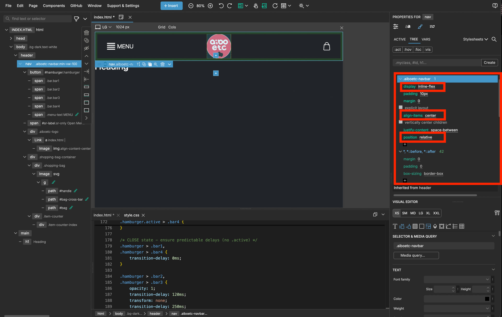
What styling to your navbar custom class do you have? Because position fixed and absolute takes elements out of the flow of the DOM. it no longer occupies layout space. Hence the H1 would go to the top of the parent body.
edit ; yeah you have a position absolute rule, on your class .aiboetc-navbar, remove that or compensate for the height of the navbar on the top of the body.
1 Like
Yeah, ive just noticed that.
1 Like
I just made the guess based on the behaviour and seeing that custom class without details. Then saw the CSS.
1 Like
Gone 3am here.
1 Like
Its now 4am, so , good night
ps, that is accomplished by ignoring most of what I said and just changing the positioning from@PeteSharp said.
I guess id better not give up my day job.
1 Like
TEMPEST
February 15, 2026, 1:19pm
19
@PeteSharp @schpengle
Thank you both; yes, changing ‘absolute’ to ‘relative’ fixed the whole thing - I didn’t know that ‘absolute’ took it out of the DOM. I was trying to get all the 3 differently sized objects to have their centres on the same horizontal line and that was how I came up with a fix other than magic numbers which felt (and smelt) wrong.
Thank you both.
1 Like
You don’t need the position rule at all. I’d remove it as mentioned above.


