I probably got this all wrong, but I thought selecting the little brush “Active View for CSS Editing” meant that any CSS additions, alterations, or deletions would affect ONLY that device size (@media) and not affect any of the other sizes unless the brush was de-selected. But seemingly this is not the case… or is it and I’m doing something wrong?
Hi @randyrie,
Not exactly. It will only show rules that impact (always get affect vs effect wrong) that view. If you have a new rule without a media query, it will also impact that view.
Sorry,
Bob
Thanks @RobM for replying. That is what I thought…
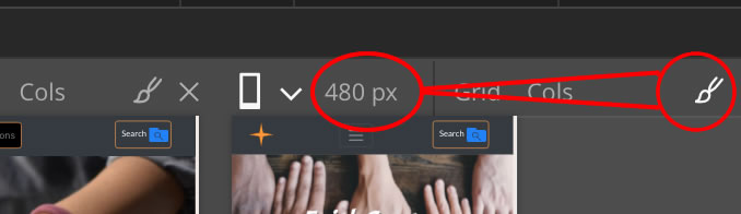
I’d like to post a feature request that the PG developers put a “Add Media Query” button next to the brush that places the appropriate CSS code in the site’s style sheet to create a media query. Then when the corresponding brush is selected, only that media query’s CSS code block is affected/modified. See my attachment:

Waddya all think? Any merit to this as a suggestion and is it possible?
Hmm - the only issue I would have is that media queries aren’t for a set width. For example, in the above screenshot you have a “max-width: 375px”. Would that always be the default? So for the display at 480px would clicking the button be for the max-width? If you wanted to set say, min-width: 380px to max- width: 480px you would do it through the normal style panel? Seems like it would have to have a lot of settings to be useful.
I think its a plausible @feature-request that when making edits within a specific breakpoint in Pinegrow, then that CSS gets written into the corresponding media query. Such an approach would streamline the process for users.
I’m aware of other apps which offer this approach, for example Blocs App. Here its discussed in the docs and below is a basic example usage I was also able to find.

Maybe its worth considering how the current workflow in Pinegrow might be better streamlined and improved? I think there are other various areas which could be improved in this regard concerning responsive design and media queries within Pinegrow (but I’ve never posted those ideas).
But yes @RobM you address a good point regarding underlying logic that would need to be considered.
here’s my thot.
if PG took just a bit more liberty with the CSS format it could offer to create a media query and place any new styling there when ever that rule is active. Something along the lines of the Grid editor, and in fact might be integrated into the grid editor since that’s often on of the things you need to mess with at different screen sizes.